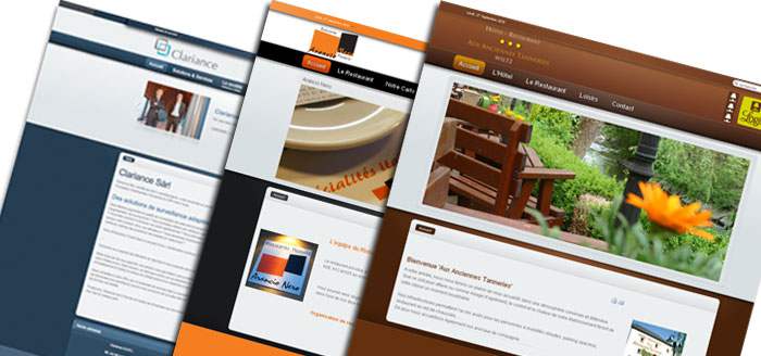
 Responsive design is no longer just something you’ll find on the portfolio websites of the designers and developers who pioneered the idea. These days using media queries to adapt to varying screen sizes is well on its way to being a mainstream design goal.
Head over to a responsive design showcase like Media Queries and you’ll find plenty of “real world” websites — like Opera or Arizona State University — using media queries to build responsive websites.
But while media queries are a big part of responsive design, they don’t solve every challenge the small screen presents. For example, many otherwise great responsive websites still serve full size images to mobile browsers. Many responsive sites use the max-widthimage scaling technique which dynamically resizes your image to fit the screen, but sadly that doesn’t downsize the actual image file.
Using the max-width trick neatly handles images on varying screen sizes, but, by itself, it doesn’t address the bandwidth issue. In fact, loading big images and forcing mobile browsers to scale them is the worst of both worlds — large image downloads and processor-intensive downscaling. And, not only are large images a waste of bandwidth for mobile users, with mobile data caps becoming more common, you may well be costing your visitors money.
A far better approach is to use the max-width trick, but also serve smaller images to smaller screens — that means less bandwidth and little or no downscaling. Mobile platform consultant Peter-Paul Koch has a nice overview of how JavaScript can be combined with media queries to swap out your mobile-size images for larger ones on larger screens. The developers at Filament Group refined this approach with the Responsive Images project.
However, as nice as the Responsive Images approach is, it requires maintaining two sets of images on your server. For existing websites with content management systems already up and running, and tons of images tied to existing content, it can be difficult and time consuming to go through and create a second set of smaller images.
The burden of an existing CMS led developer Matt Wilcox to take a different approach to the mobile image problem. The result is what Wilcox recently decided to call Adaptive Images. The Adaptive Images script works much like the Filament Group’s Responsive Images code, but Adaptive-Images manages its own image resizing so there’s no need to do anything to your existing website — just drop in the Adaptive Images code and you’re done.
There is, however, one other big difference between the two that’s worth noting — the Filament Group’s Responsive Images takes a mobile first approach while Wilcox’s Adaptive Images does not.
That is, if JavaScript is disabled, Responsive Images falls back to using only the small image. Adaptive Images on the other hand will fall back to the large image. While we generally suggest taking a mobile first approach, in this case the convenience of slipping Adaptive Images into an existing site outweighs the advantages of a mobile first approach. However, if you’re building a new site from scratch and your CMS can’t handle tracking separate image sizes, chances are you’re using the wrong CMS.
To get Adaptive Images up and running on your website you’ll need to have an Apache 2 server with PHP 5.x installed. For more info, head on over to the Adaptive Images website or you can grab the code from GitHub.
See Also:
Authors:


